
What is in a Brand Mark? The Evolution of the Ctrl Hub Brand
Learn about our updated brand mark, including the reasons why we've made the change.

It turned out to be quite a complex and involved process – not least of all because we had an existing logo to which we had become accustomed and attached over the past 8 years.
As well as our own affection for the original logo, we felt that it had built up some goodwill and brand recognition within the sectors in which we operate, notably within utilities and construction. However, we also felt that it was time to freshen things up as we carry out a major upgrade to our website and our software as a service (SaaS) platform. We have also grown significantly since that original logo came into being. It was an ideal time to reassess what our brand mark represents, and to come up with a design that was more modern.
Why Ctrl Hub anyway?
To understand the original logo, we first need to understand the reasoning behind the name “Ctrl Hub”. Having zero experience of branding when we first set up, we worked with creative agency Layers Studio on the original brand. Layers’ Managing Director James Hanson came up with the name following a series of workshops with our leadership team.
Ctrl – in essence, what the platform is all about; control over processes, operations, risk, safety and compliance; the keyboard shortcut Ctrl reflects the forward-thinking world we live in, as well as the fast, digital route to vital information that any business needs.
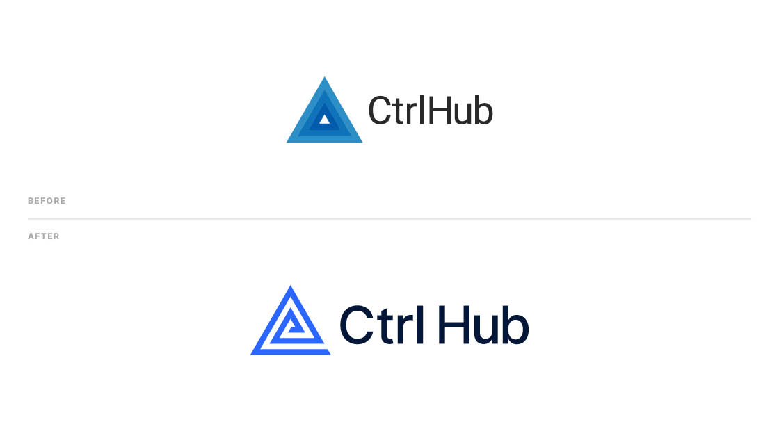
Hub – the centre around which everything revolves and radiates from; the central point where information is gathered, processed, viewed and utilised. The original logo – the varying shades of blue coming out from a central white triangle – reflected this.
The original name suggestion was Ctrl Centre – but being the ambitious team that we are, we have the US market in our sights. We saw the different spellings of “centre” and “center” as being problematic in the future, particularly in the context of domain names and internet search engines.
Why the triangle?
The triangular shaped logo was chosen as it represents a hazard warning sign. That triangular sign is typically shown in red to signal danger. Think of the following:

The blue of Ctrl Hub represents a contrast to that danger, cooling down the red, controlling and managing the risks.
Practical issues
There were also some practical elements to consider. While we liked the appearance of the different shades of blue on the old logo, they did not translate well when it came to printed materials. Quite often the printed appearance didn’t match the digital version. The different shades of blue also looked ineffective against colours other than black and white, limiting our options for placing the logo on pictures for example. Having a single colour logo would give us a lot more versatility going forwards.
Where did the Ctrl Hub concept come from?
Ctrl Hub came into being as a tool to manage our own contracting businesses, which operate in the utilities and construction sectors. We built the original platform to help manage risk, safety and compliance, to promote the ongoing wellbeing of our people, and to allow our businesses to grow and evolve. We felt that this needed to be reflected in our brand.
The triangle represents the management cycle of our businesses, using Ctrl Hub. It works in a very similar way to the traditional Plan-Do-Check-Act (PDCA) model that is associated with ISO management systems. We actively use the platform to manage our various ISO certifications within our Group, including Ctrl Hub’s own ISO:27001 and ISO:9001 certifications. How do we do that?
The Cycle of Evolution
We plan and set things up on the platform, uploading policies, procedures, people, assets etc. We then utlilise the platform to carry out the work, allocating jobs to teams, carrying out risk assessments, capturing data in the field. We review and analyse the information captured, and utilise it to improve what we do. We refine our processes, identify gaps in knowledge, train and upskill our people, before planning in the next round of work.
The cycle goes on.
However, rather than remain in a perpetual loop as that traditional PDCA model is represented, we saw our companies growing ever outwards through a process of continuous improvement. To this extent we saw that growth spiralling outwards like a Fibonacci sequence. Applied to our triangular model, we see that spiralling cycle of growth take shape.

Our platform is also evolving continuously. It allows our clients’ businesses to grow and flourish, and grows with them, based on their feedback and input.
Why else did we settle on that logo?
It is clearer and sharper, and more modern looking. It is singular in colour, giving us greater flexibility of use. It looks like a maze, seen from above, representing our clients navigating the maze of compliance to which they are subject. The appearance of an “e” at its centre represents the universally recognised abbreviation of electronic. Finally, and coincidentally, it bears more than a passing resemblance to the @ logo, another common signifier of all things modern and tech. Maybe that last one is clutching at straws somewhat, but to us it all ties in nicely together to give us our final, new brand mark!
The feedback from our staff has been very positive. Most see it as a step forward. One or two have expressed a view that there was nothing wrong with the logo – it is human nature to resist change, as we encounter on a regular basis in the work that we do.
The development and selection of a new logo is a very subjective thing. What resonates with one person might turn another person off completely! We would be interested to hear your thoughts on our logo and the process behind it, and to hear about your own experiences.Ctrl Hub has just updated its logo – or brand mark – for the first time since the company was formed, back in 2015. Why have we done this? Was it a simple case of being ready for a change, being bored of the previous brand mark? What are the thoughts and considerations that go into a new logo?
● find out more
One piece of software.
Infinite peace of mind.
Take Ctrl.
Talk to our teamshow your support
